The grid is the parent element and the grid-items are the children.
.grid {display: grid;}Grid - block level element, the width of the grid is the width of the parent element.
Inline Grid - inline element, the width of the grid is the width of the content.
Grid Lines The lines between each row and column and defines the location of each item.
Grid Cell Single unit of grid where grid row and column intersect
Grid Track refers to grid column or row
Grid tracks are defined in the grid container with grid-template-columns and grid-template-rows.
.grid {
    grid-template-columns: 100px 100px 100px; /* 3 columns */
    grid-template-rows: 100px; /* 1 rows */
}
The fr can also be used to define the size of the grid tracks. fr is the fraction of the available space in the grid container. repeat() can be used to repeat the track size.
frand width can be used together, eg.1fr 100pxindicates that the first column will take up all available space except for 100px reserved for the second column.
.grid {
    grid-template-columns: repeat(3, 1fr); /* 3 columns */
}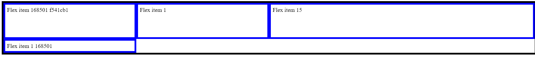
In this example, 3 columns are 2 rows are explicitly declared and there are 4 elements in a grid
- the size and rows and columns are explicitly declared
- since only 1 row is declared, and there are an element that goes to the second row that is implicit
Implicit Grid
Implicit grid uses the grid-auto-columns and grid-auto-rows properties to define the size of the implicit grid tracks.
.grid {
    grid-template-columns: 100px 100px 100px; /* 3 columns */
    grid-template-rows: 100px; /* 1 rows */
    grid-auto-rows: 200px;
}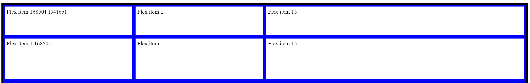
- in this example any elements except the first 3 will have a height of 200px
Grid Gap
Grid gap is the space between the grid tracks. It can be defined with the grid-column-gap and grid-row-gap properties or the shorthand gap.
.grid {
    gap: 10px 20px; /* row gap 10px, column gap 20px */
}