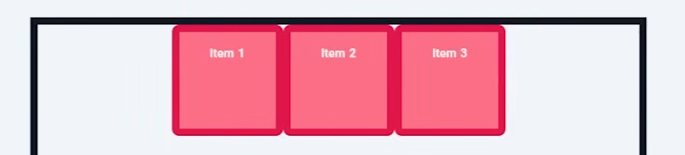
Flex container: the parent element
Flex items: the child elements in a flexbox
Flex by default is arrange in rows but can be changed to fiex-direction: column;
- other properties include
row-reverseorcolumn-reverse
Flex is defined bydisplay: flex
<div class="flex">
	<div class="flex-item">flex item</div>
</div> <!-- Parent-->
.container { display: flex; }- each flex item will be displayed in a row
- inline flex allow multiple flex container in the same row like inline elements
The height of flexbox will be the size of the tallest item.
flex-wrap
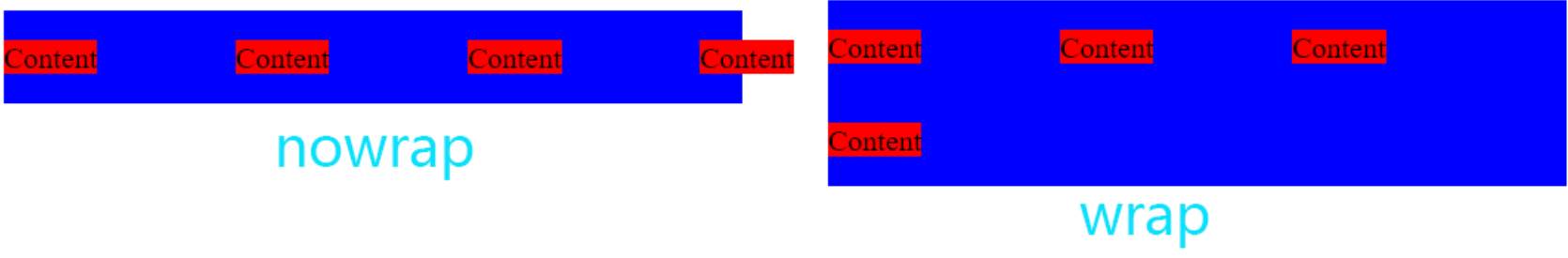
nowrap - the layour will continue, if it’s too large, it will be cutout
wrap - if all the flex items together are larger than the flex container, it will go to the next row
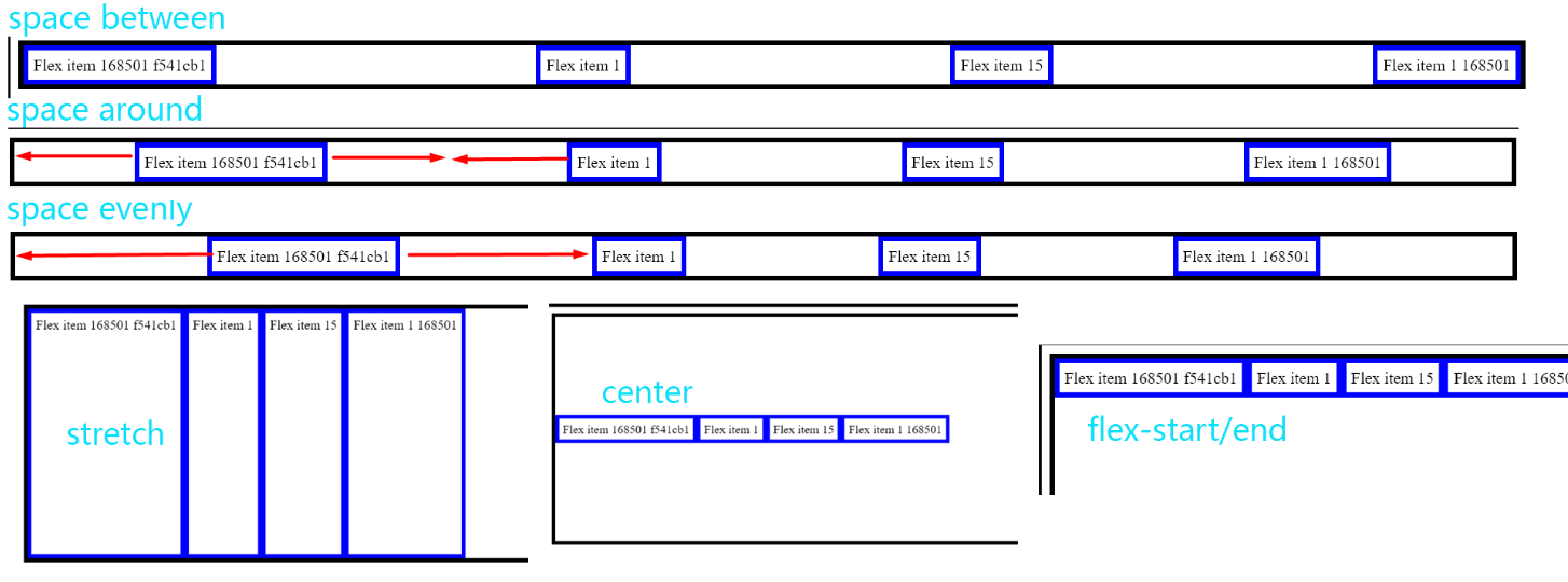
align (applied to flex container)
justify-content: can be flex-start end or center which determine how each item will be aligned in the flex in the main axis (eg. default is horizontal)
space-between: add horizontal space between but it starts and ends without spacespace-aroundadd same spacing on both horizontal side, the space between flex items is 2x of the space between flex border and itemspace-evenly: the spaces between any element is the same- since by default flex is horizontal, if a flex is vertical, the the
justify-contentwill act on vertical axis
align-items: align flex items on the cross axis - there are 4 options that determine how it will be aligned
stretch(default)centerflex-startflex-end
Flex Property (applied to flex-items)
flex-grow - only applies it there is extra space in the flexbox
- grow will allow items in the flexbox to fill up all the spaces in the flexbox
- the unit is relative to the other items in the flex
- if the grow is applied to all the item, then it will grow by the same size
- if the grow is applied to one or more item, only these items will grow and the units will be relative, 2 means it will takes twice as much space


flex-shrink- determines how much the length will shrink relative to other items
- if this value is set to 0, the item will not shrink even if it cuts off
flex-basis- sets the size of content/border box - when set to
x pxthe flexbox will have the maximum width of x pixels
The flex property is also set by the short-handflex
* { flex: grow, shrink, basis }